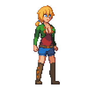
after getting some feedback from various sources, i've been reworking the main character sprite and color scheme to make it a bit more pleasing to the eyes - and hopefully a bit sexier, too. the main problems i saw were that her color scheme was a bit flat; the highlights on her body made her look like plastic, and the way her hair contoured to her face, along with the scowl she had, made her look far more masculine than she should.
with those changes in mind, i've redesigned her accordingly. thoughts/opinions?
in addition to that, i mentioned in an edit to my last post that i got a skype account. to be honest i haven't used skype much, so im not sure if it actually gives me a notification when anyone adds me. to be safe, if you add me, shoot me an email at ms.anon42@gmail.com to let me know what your skype handle is so i can add ya back. i'll be on skype whenever i'm working so it's more than likely you'll get sneak peaks of whatever it is i'm working on at the moment.
-A42
EDIT: here's a design for a potential enemy i worked on today, if anyone's interested.


I find that new character is much better, I see that you had followed the advice of kyrieru.
ReplyDeleteto a degree. i certainly used his sprite as inspiration, but it was a pretty drastic change. it's more of a middle ground between the two. the color shift isn't as drastic as his was, and i didn't change the shape of her face entirely either. it still has a bit of touching up to do but i like it quite a bit more now.
Deletei like your face shapes much better.
ReplyDeletei actually really like this almost-oversaturated style. i hope you keep it this vivid.
There are going to be multiple enemies? The enemy you've shown so far is nice, but I'd like to see other types if possible.
ReplyDeleteof course there will be multiple enemies, lol. i just started working on the game so i haven't had the time to concept a lot of them. this guy is just the start.
DeleteThe re-work actually does suit her a lot more. Looking good so far :D
ReplyDeleteWeirdly, i want the old colors back. (0.0) though i guess it's because i think if the game as more of a darker one like you wanna make it similar to kurovadis, but this is gearing more towards eroico. Just my opinion. :)
ReplyDeletewell, vivid colors doesn't necessarily mean it won't be a bit darker. i do intend it to be dark, environment-wise, so if the colors don't end up fitting well once i get to that point, i'll mess with them more. :)
DeleteOk, cool, just don't wanna be going a psychedelic trip through wonderland, unless the games trying to go that way, just wondering. ^.^
Deletethat run animation looks sweet - very nice, props.
ReplyDeleteLooks great, just gotta work on dat ass
ReplyDeleteThe feet look a bit off, maybe some heels or just a tiny bit more detail would help?
ReplyDeleteTwo words: Idle Animation.
ReplyDeleteDon't get me wrong. Game can do without it =) But if the character will at least visibly breathe when she's standing... It's a nice little detail, but it has to be done right. Not the - hair is waving when there is no wind kind =)
Also while i understand that this is your character design, there is something off about her. Maybe it's the lack of an actual shoulder when she's running. Or lack of buttocks...
the game isn't complete. i'm going to add an idle animation, but those things take time. getting everything functional is more important right now.
Deletei've tried giving her a bigger butt. the line between 'looks real' and 'ass tumor' is ridiculously thin. don't know what you mean about her shoulder though, first time i've heard that complaint.